
It is already available a new plugin to gvSIG 2.0 that allows us to work with one of the documents most requested by the user community: charts. Charts increase the chances of gvSIG users to represent and analyze geographical data, complementing the information provided by the maps.
Charts have many utilities and undoubtedly are a simple and visual way to compare entities, distributions, trends, etc.
This post starts a new set where we will be able to know about the possibilities that gvSIG give to us regarding the work with Charts.
To install this new feature we will follow the usual procedure, open the Add-on Manager, select Install from URL, choose the server http://downloads.gvsig.org/download/gvsig-desktop/ (soon there will be available other gvSIG repositories) and check to install the Document: Charts.
Once installed, when gvSIG reboot to see the applied changes, we will find that gvSIG has a new type of document: Charts. In order to create the first chart we need to have at least one available table in the gvSIG project, whether an attribute table from a shapefile, or simple table.
We will make the first gchart from a table containing information of the worldwide population. We want to chart only the South American countries, so please, select these ons before proceeding to create it.
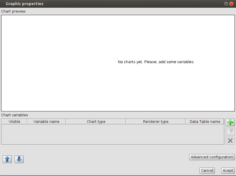 Selecting the document type “Charts” and clicking “New” we will be creating our framework to the new content. Now we just need to set their properties in order to see it.Press the button to add (button set with a “+”) we access the chart settings. By default the plugin lets us choose between 4 types of charts: pie, XY, temporary or bar.
 The next example is about a pie chart. In the “Data Source” next tab select the table and the data fields to be used for the chart. In this case we will use as Tags the NAME field (which contains the name of each country) and for numerical values the POP2005 field (which has information about the population of these countries updated to 2005). We should activate the tab “Use only selected fields”.
 In the last tab we will be able to set the “chart format” by selecting the following properties such as background color, contour or size.
We have it all! Click on Ok and the first chart will be created.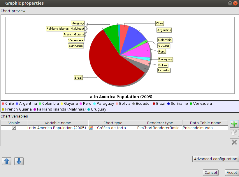 By the way, the same Chart document can be composed of different charts, but this will be seen in a later post.
Lastly there you have a couple of videos showing the installation of the plugin and the steps taken in order to create the first chart.
Note: If you’re using Windows OS, remember to run gvSIG as administrator to install any new plugin.


There is a greater tendency to over compensate when you are
looking to compensate for a perceived fault in any given
relationship. It’s also incredibly important that you don’t stop living your life at this point.
By doing so, you could end up saving yourself a great deal of
heartache if, for some reason, the relationship does not fare well again.